COULD YOU INTRODUCE YOURSELF IN A FEW SENTENCES?
I’m Molly Dyson, an illustrator and graphic designer from Australia currently living and working in Berlin. My work mixes nostalgic low-fi aesthetics with digital graphics and typography.
WHAT IS GOOD DESIGN FOR YOU?
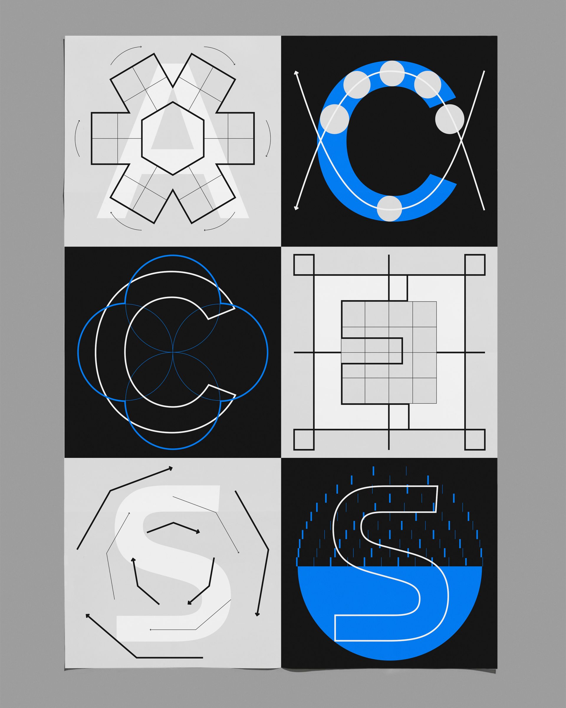
That’s a tricky question. I like design that has something particularly human about it. I’m drawn to design that is expressive, emotional, silly or tells a story about why it is the way it is.
CAN YOU TELL US HOW YOU ENGAGED WITH THE POINT WE MAKE IN OUR MANIFESTO THAT «WE LOSE SPEED TO WIN TIME» AND WHAT THE TOPIC (IN THE CONTEXT OF DESIGN) MEANS TO YOU?
When I work, I often lose track of time and feel I’m wasting time when things don’t work out the way I plan. As a designer, I find it difficult to control how much time I spend on projects and wish I could work faster and be more efficient.
This point in the manifesto made me reflect on the amount of time it takes to complete things, and how we sometimes spiral or go around in circles to end up at a final outcome. For me, we lose speed to win time means giving in to processes that aren’t necessarily efficient or productive but, in the end, give you a sense of satisfaction and a feeling of time well spent.
HOW DO YOU SLOW DOWN?
Probably like every other person on earth, I try to look at my phone less, but I am terribly addicted to it: an obvious new year’s resolution would be less screen time, lol!
But definitely, reading a book, or just looking at the window, and letting myself stare out of the window can be a good time break. Five minutes staring out the window feels a lot longer than five minutes of doom-scrolling on the phone! So that feels like winning time.
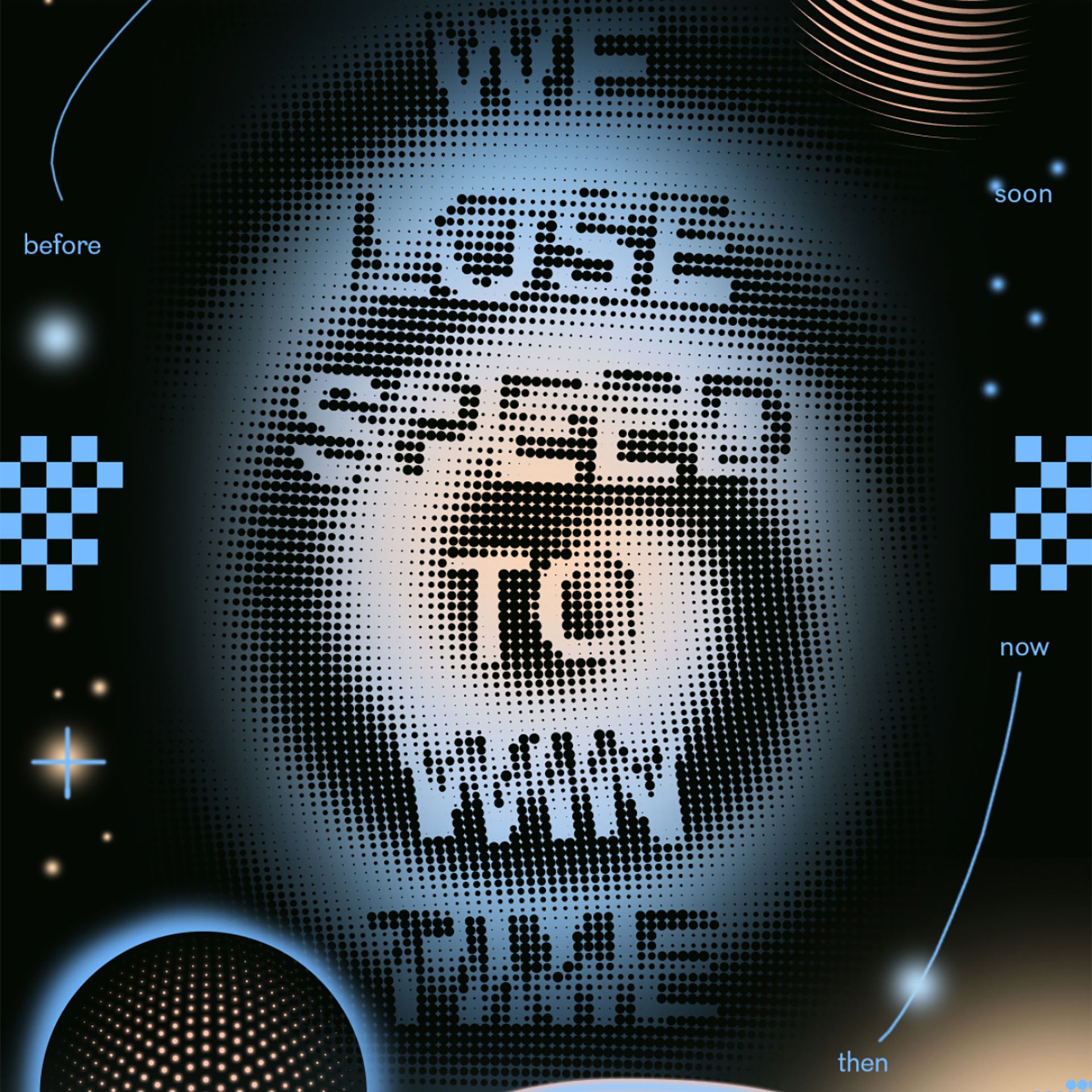
COULD YOU TELL US THE STORY BEHIND YOUR ARTWORK?
My animated poster is inspired by the Japanese designer Kohei Sugiura, who made a series of infographic ‘Time Distance Maps’ that measured things like the time it takes to get across a city compared with the actual distance to the city itself.
I was interested in how these transient concepts of time and speed could be visually depicted. Since Covid and during lockdowns, I think we have all noticed a change in how we experience time. The concepts of future, past and present have become rather slippery; the past or the before feels very long ago, and the future is difficult to anticipate.
I based my design on the spiral motif, the slowly paced snail, wormholes, and a time/space continuum loop. The animations float between words we use to describe time and speed; before and after, soon and later, now and then. The whole poster loops and gives a sense of endlessness.
HOW IMPORTANT IS «TIME» FOR YOU? / HOW DO YOU VALUE TIME?
Time is incredibly important to me, but I also try to ignore it. For example, on my computer, I have the time shown by an analog clock-face instead of digital numbers. This way, I don’t stress myself out by glancing at numbers and realizing 10, 20, 30 minutes have flown by.
I try really hard not to get angry at myself for ‘wasting time’ and remind myself: time just passes, whether you notice it or not.